Renew.
Restore.
Recharge.
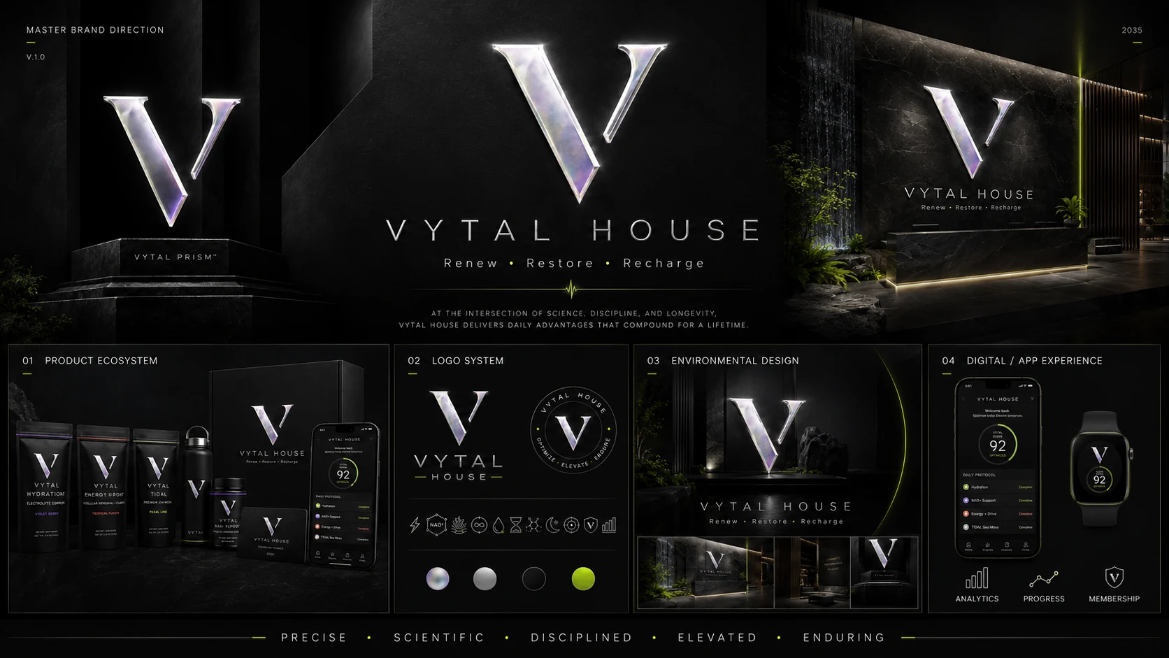
VYTAL House brings one precise visual and experience system across the House, VYTAL Air, VYTAL Arc, VYTAL One, products, digital touchpoints, and environmental design.
One master system.
Distinct expressions.
The approved architecture keeps the iridescent platinum V, obsidian environments, titanium typography, and acid-lime signal consistent while each sub-brand carries its own purpose.
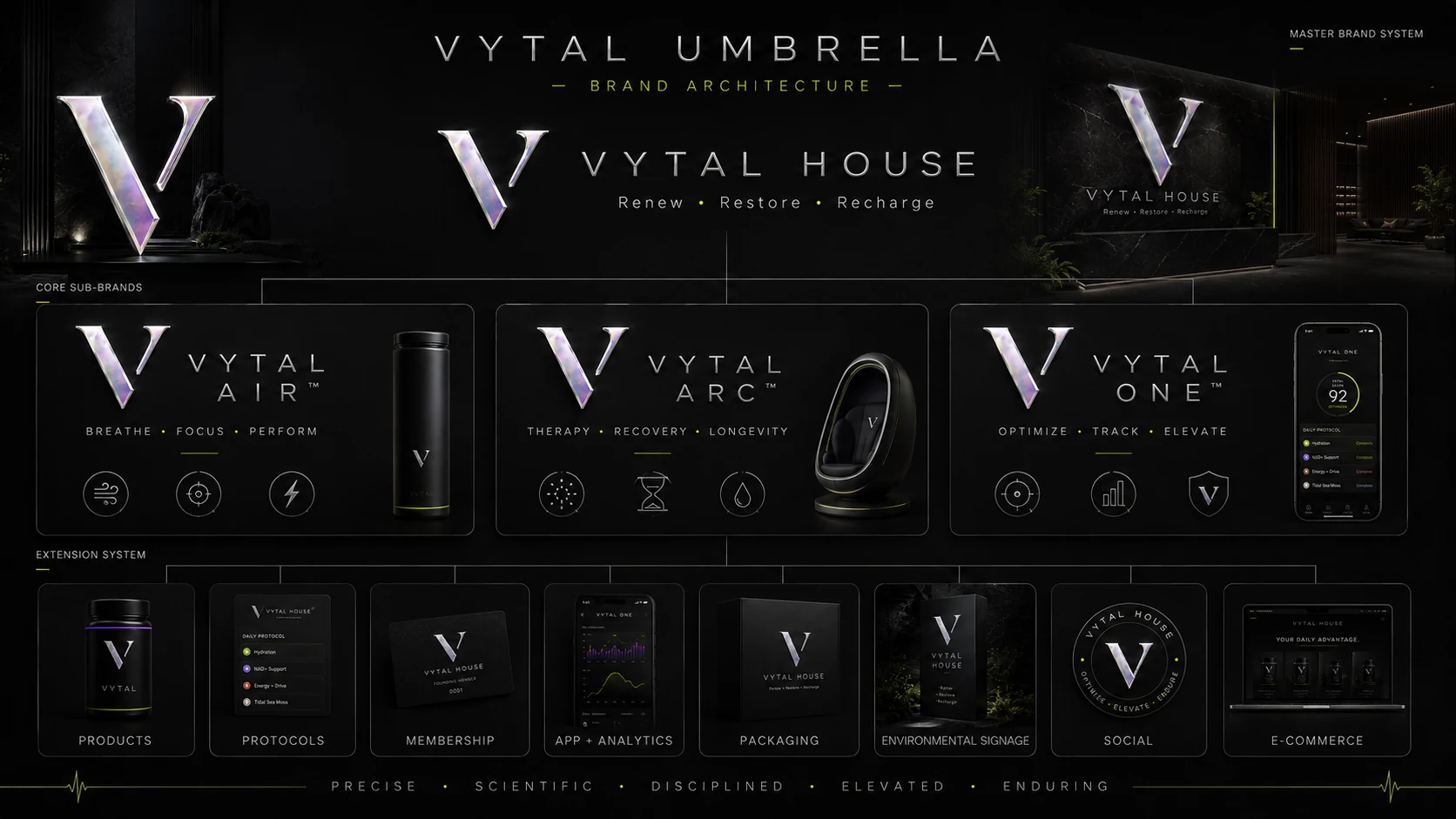
VYTAL Air
Daily performance and respiratory-focused extension of the VYTAL system.
↗VYTAL Arc
Precision recovery expression designed around therapy, restoration, and longevity.
↗VYTAL One
The access, membership, protocol, and analytics layer connecting the ecosystem.
↗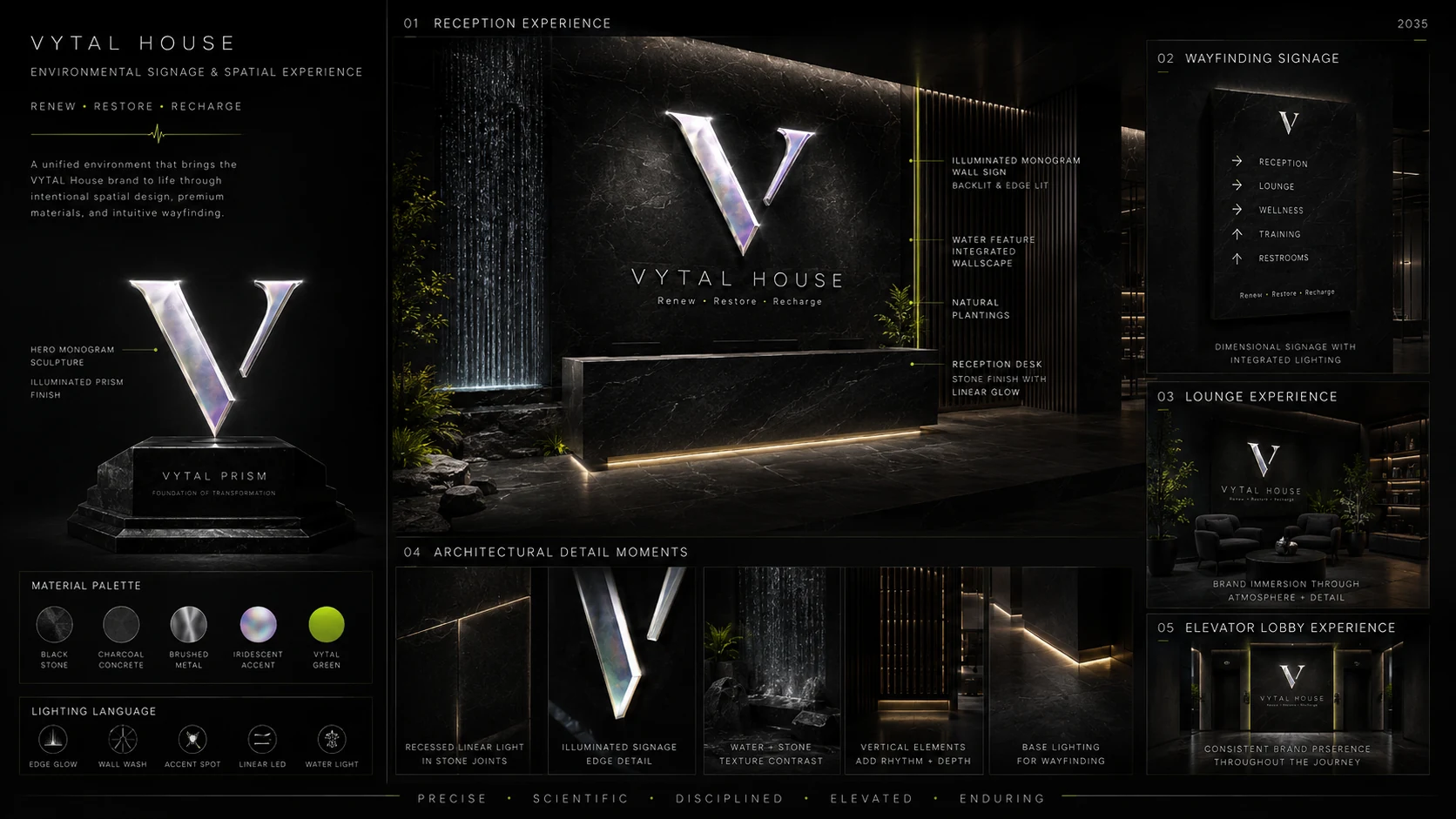
Brand becomes space.
Black architectural stone, smoked glass, brushed titanium, natural planting, controlled lighting, and iridescent platinum signage create one continuous arrival-to-experience language.
- Reception and arrival
- Wayfinding and lounge
- Illuminated V monogram
- Architectural light + material discipline
A scalable product family.
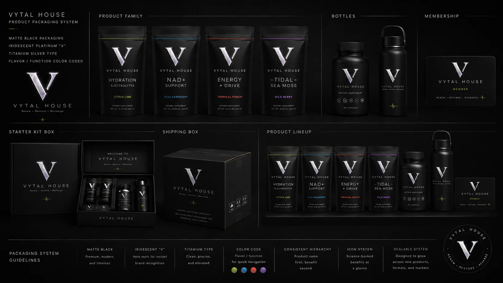
The product system uses matte black packaging, the platinum V, titanium type, restrained function color-coding, and the same visual hierarchy across pouches, bottles, kits, membership, and shipping.
The same language on every screen.
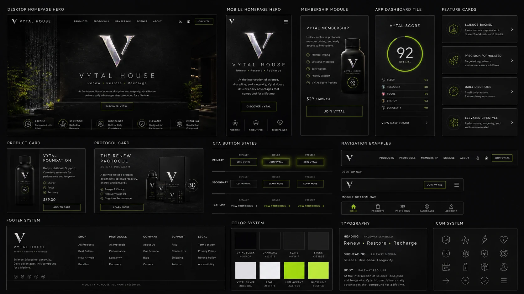
Desktop, mobile, membership, app dashboards, navigation, cards, CTAs, and utility icons all use the same obsidian, titanium, prism-silver, and signal-lime hierarchy.
“Daily advantages that compound for a lifetime.”
Science • Discipline • Longevity